MatekVÁR
Making math feel like play for Hungarian children — web and mobile
Role
Lead UX/UI Designer
Year
2024
Deliverables
Overview
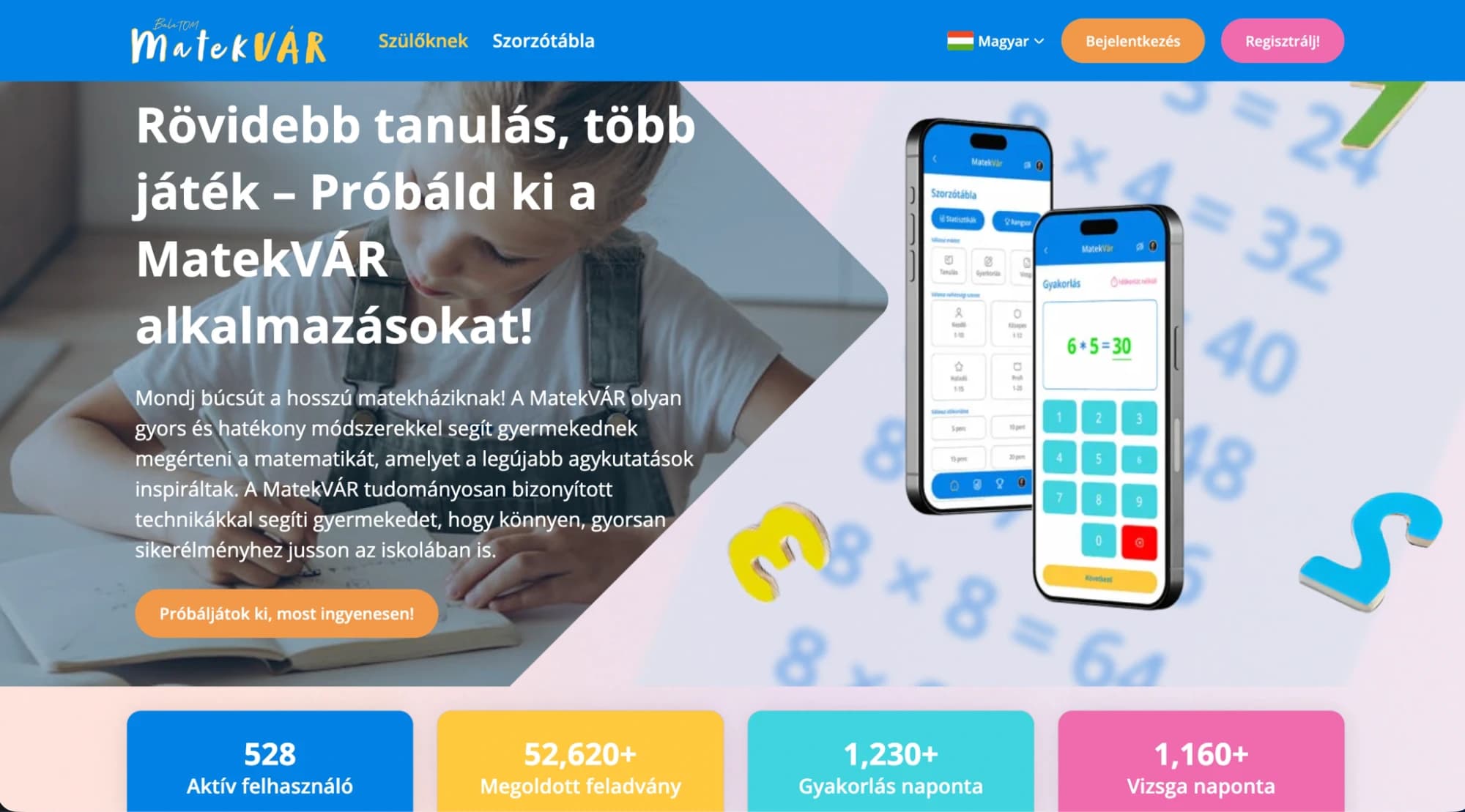
MatekVÁR is a Hungarian educational platform that helps children master mathematics through scientifically-grounded, game-inspired practice — faster sessions, more engagement, better retention. The platform runs on both web and mobile, serving parents, students, and teachers with a single unified product experience. By launch it had already accumulated 528 active users, 52,620+ solved tasks, and strong daily engagement across practice and exam modes.
Challenge
Educational apps for children face a specific UX dilemma: the product has to satisfy two audiences with completely different expectations at the same time. Children need the interface to feel fun, rewarding, and immediately understandable — any friction kills the habit. Parents evaluating the product need to see credibility, safety, and educational rigor — any frivolity erodes trust. Designing an experience that genuinely serves both without compromising either required careful thinking about hierarchy, visual language, and how information was presented on every screen.
Solution
I designed the full product across web and mobile, centering the visual language around a bright, energetic palette — blues, oranges, and teals — with clear typographic hierarchy and generous spacing that works for younger users. The core learning flows (practice, multiplication table, exams) are each structured as self-contained sessions with clear start and end states, immediate feedback on answers, and progress indicators that make every session feel like a small win. The homepage communicates both the playful experience (for children) and the proven engagement stats (for parents) in a single layout. Mobile screens were designed for one-thumb use with large touch targets and minimal cognitive load per step.
Outcome
A polished, dual-audience edtech product that earns trust from parents and daily engagement from children — with measurable impact visible in the platform's own usage metrics from launch.
Key Highlights
- Dual-audience design: engaging for children, credible for parents
- Web + mobile product designed in a single consistent Figma system
- Gamified practice flows with immediate feedback and session progress
- Multiplication table module with structured difficulty levels
- Social proof built into the homepage: active users, solved tasks, daily sessions
528
Active users
52,620+
Tasks solved
1,230+
Practice sessions/day
1,160+
Exam sessions/day
Design Process
Audience Mapping
Mapped two separate user journeys — the child using the product, and the parent evaluating and purchasing it. Designed each screen to serve both simultaneously without conflict.
Core Flow Design
Designed the practice, exam, and multiplication table flows as distinct session types, each with clear entry, mid-session feedback, and completion states.
Mobile Adaptation
Translated all web flows to mobile with enlarged touch targets, simplified layouts, and one-action-per-screen discipline suited to younger users.
Dashboard & Stats
Designed the parent-facing statistics view to surface meaningful engagement data — daily active sessions, task completion, and progress over time.