There's a test UX designers use called the five-second test. You show someone a page for exactly five seconds, take it away, and ask: what do you remember? What was the page about? What could you do on it?
The results are consistently humbling. Users remember the headline (sometimes), the hero image (usually), and the general feeling of the page. They rarely remember the subheadline. They almost never remember the feature list. And if the page felt cluttered or unclear — that's the only thing they remember.
Five seconds is not a test limitation. It's reality.
What Actually Happens in 5 Seconds
When a user lands on a page, their brain is not reading. It's scanning and feeling. Two parallel processes happen simultaneously:
Cognitive: The brain scans for structure — headline, image, CTA. It's looking for a quick answer to "what is this?" If the visual hierarchy is clear, this happens fast. If the page is cluttered or the hierarchy is weak, the brain stalls.
Emotional: At the same time, the brain is forming an aesthetic and trust judgment. This happens in as little as 50 milliseconds according to research from Carleton University. Professional-looking, visually clean designs get a trust signal. Cluttered, outdated, or inconsistent designs get a negative signal — and that impression is extremely difficult to reverse.
These two processes don't happen sequentially. They happen together, and they influence each other. A strong visual hierarchy makes the page feel more trustworthy. A trustworthy design makes the content easier to process.
The Four Things Users Judge Immediately
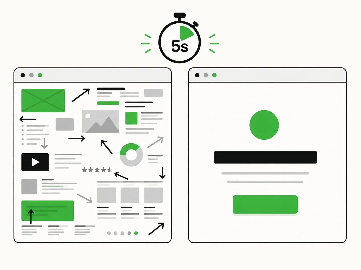
Visual clarity. Is there one dominant element that draws the eye? Or are there five things competing for attention? The eye needs a starting point. If everything is equally prominent, nothing is.
Professional quality. This is not about being expensive-looking. It's about consistency. Mismatched fonts, inconsistent spacing, low-quality images, or off-brand colors all trigger a subconscious "something is off here" reaction that erodes trust before a word is read.
Relevance. Does the hero image or headline immediately signal that this page is for them? Stock photos of generic business people in meetings are universally neutral — which means they're useless. Specific imagery that shows your actual product, your actual users, or your actual context converts better because it triggers immediate relevance.
Load speed. This is invisible but not irrelevant. A page that loads slowly creates a negative experience before any design element has even appeared. Google's data is consistent here: conversion rate drops significantly as page load time increases. Speed is a design decision.
Designing for the First 5 Seconds
The practical implication of all this is that your above-the-fold section is doing most of the work. Here's how to audit it:
One headline, one idea. Your headline should make a single clear claim. Not three benefits. Not a clever play on words that requires two reads. One thing, stated directly.
Hierarchy that guides the eye. Headline → supporting visual or subheadline → CTA. In that order, with clear size and weight differences that make the sequence obvious. If a user doesn't know where to look after the headline, you've lost them.
Social proof near the top. A single strong testimonial, a recognizable client logo strip, or a "trusted by X companies" badge near the hero significantly increases the trust signal in that first impression window. Not buried — near the top.
No carousels. Rotating hero banners are the design equivalent of saying six things at once. They dilute attention and reduce the clarity of that first impression. A single, intentional hero message always outperforms a carousel.
Test Your Own First Impression
The simplest way to test your page: close your eyes, open it, and start a five-second timer. When the timer goes off, close it. What did you see? What do you remember? What was the page about?
If you can't answer clearly — your users can't either.
First impressions don't get second chances. Design the first five seconds deliberately, and everything that follows becomes easier.
Want to know what users actually see when they land on your site? Get in touch — a UX audit starts exactly here.