Eldelia
An AI companion app that keeps seniors connected, confident, and cared for
Role
UX/UI Designer
Year
2026
Deliverables
Live Site
www.eldelia.com/ ↗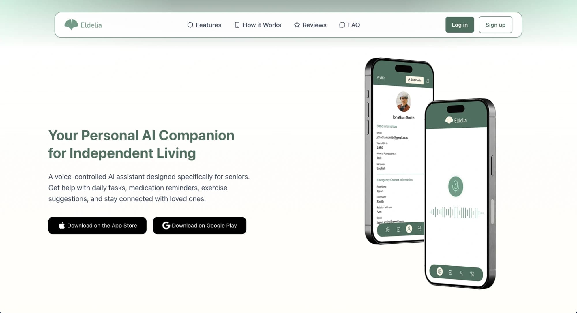
Overview
Eldelia is an AI-powered digital companion for seniors living alone — available on iOS and Android. The app combines a voice-based AI chat interface with practical daily tools (medication reminders, shopping lists) and a long-term memory system that learns from past conversations to deliver genuinely personalised interactions. The product launched to international markets in English and German, and holds a 4.8/5 rating on Trustpilot from nearly 50 reviews.
Challenge
Designing for elderly users is one of the highest-stakes UX challenges: the audience is often unfamiliar with smartphones, easily overwhelmed by busy interfaces, and quick to abandon products that feel cold or mechanical. At the same time, Eldelia's core experience — AI conversation — is inherently abstract and difficult to make feel safe and human. The design had to make a genuinely advanced AI feel warm, predictable, and trustworthy to people who may never have used a chatbot before.
Solution
I designed the full product UI around one principle: reduce cognitive load at every step. Voice interaction is the primary input — no keyboard required — with large, high-contrast UI elements and a minimal screen layout that surfaces only what matters in the moment. The onboarding flow was built to be completed in under three minutes with no technical terminology. Conversation design prioritised warmth and patience: the AI responds at a calm, readable pace, and the interface never rushes the user. Medication reminders and shopping lists are accessible in one tap from the home screen, with confirmations designed to feel reassuring rather than transactional. The memory system — which allows the AI to recall previous conversations — is surfaced subtly so users feel recognised without feeling surveilled.
Outcome
Eldelia launched on both the App Store and Google Play and reached a 4.8/5 Trustpilot rating, with reviewers consistently citing ease of use and the feeling of genuine connection. The product demonstrates that AI can be made accessible and emotionally resonant for audiences that are typically underserved by technology design.
Key Highlights
- Voice-first interface designed for users with limited smartphone experience
- Large-format, high-contrast UI built around WCAG accessibility standards
- 3-minute onboarding — no technical knowledge required
- AI memory system surfaced to feel personal, not intrusive
- 4.8/5 Trustpilot rating at launch
- Multilingual product UI — English and German
4.8 / 5
Trustpilot rating
49+
Reviews
iOS & Android
Platforms
EN & DE
Languages
Design Process
User Research
Mapped the behaviours and pain points of elderly solo-living users — low tech confidence, fear of complexity, high need for reassurance — and built design principles from these findings.
Interaction Model
Defined the voice-first interaction model: how the AI activates, responds, and recovers from misunderstanding, in a way that never leaves the user confused about what to do next.
UI Design
Designed the full iOS and Android UI — home screen, conversation view, reminders, shopping list — with accessibility as a core constraint, not an afterthought.
Onboarding Flow
Designed a step-by-step onboarding that gets users to their first AI conversation in under 3 minutes, using plain language and large interactive elements throughout.
Memory & Personalisation
Designed how the app surfaces the AI's long-term memory — conversation callbacks, personalised greetings — in a way that feels warm and familiar rather than surveillance-like.