Lucky Punch
A bold brand identity translated into a high-impact digital presence
Role
UX/UI Designer
Year
2024
Deliverables
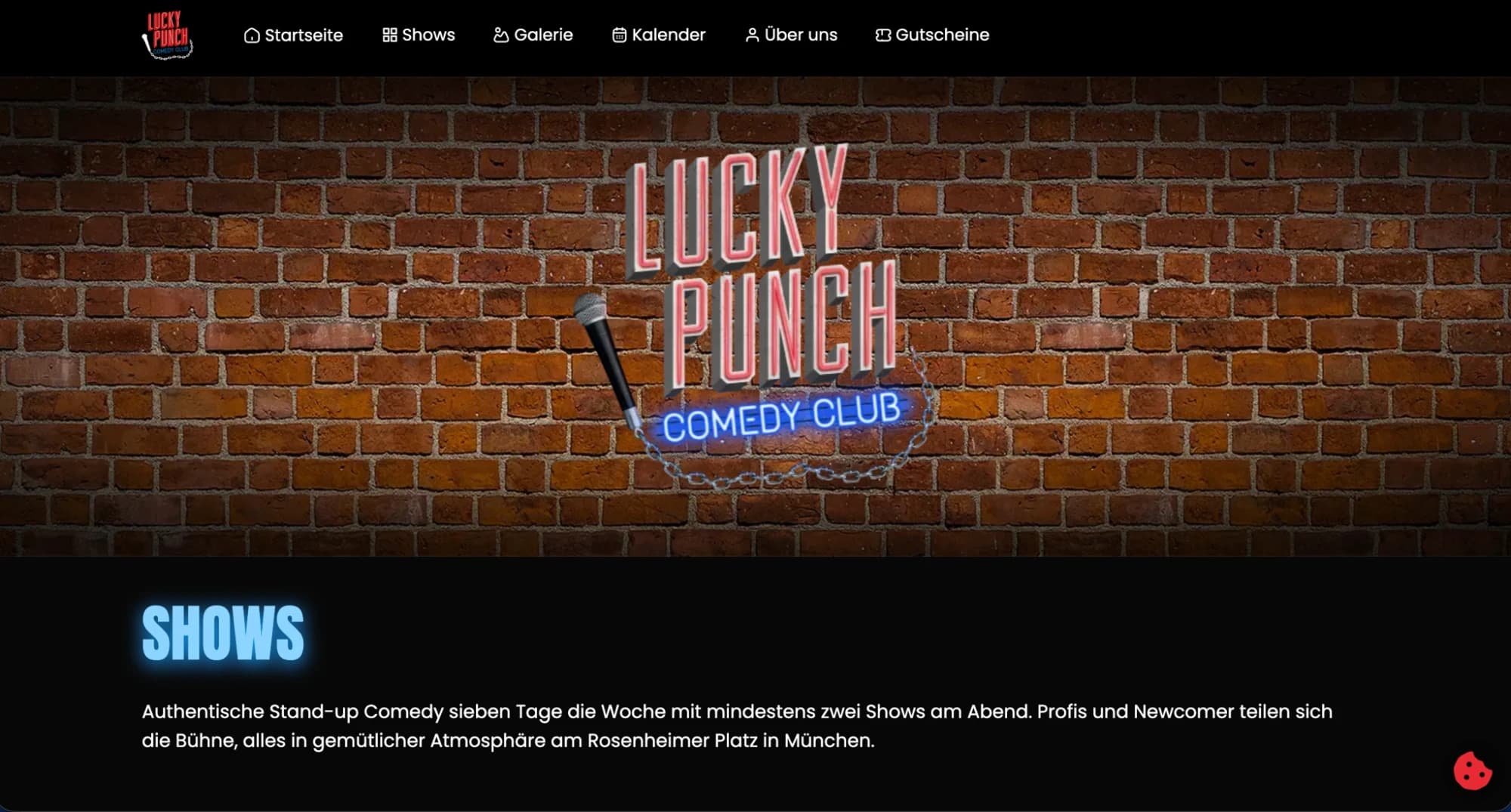
Overview
Lucky Punch is a bold, energy-forward brand that needed a digital presence strong enough to match its personality. The site needed to capture the brand's spirit immediately — within the first scroll — while still being navigable and conversion-focused.
Challenge
High-energy brand identities are often at war with usability. The instinct to design big and bold can produce sites that are visually exciting but functionally frustrating. The challenge was maintaining the brand's punch while making sure every user can find what they need and take action efficiently.
Solution
I focused the design on controlled contrast: large, confident type and bold imagery in the hero and section transitions, clean and minimal in the content areas. This rhythm gives users the brand hit they came for, then steps out of the way when they're ready to engage. Navigation is direct and unambiguous — no clever hiding of key actions in pursuit of aesthetics.
Outcome
A digital presence that doesn't compromise — full brand energy upfront, full usability throughout. The site communicates what Lucky Punch is within seconds, and converts that interest into action.
Key Highlights
- High-impact visual direction that captures the brand's energy instantly
- Typography-led design system with deliberate contrast hierarchy
- Conversion-focused page structure beneath the visual boldness
- Mobile-first responsive layout across all breakpoints